Artist Suggetions
Pointers For Good Design
Below is a list of suggestions for artists to aid in making a printer friendly ad in order to give the customer the best possible quality.
Color-Related Suggestions
- Do not use RGB – Jobs will be printed in CMYK. When RGB is converted to CMYK, any dark areas that are used for type will have 4 colors of type to register on press. These areas, if not in register, can be difficult to read.
- Use rich black (comprised of 70% Cyan & 100% Black) on black boxes that are bigger than a nickel on all jobs that will print on coated paper.
- Use 100% black on all black boxes and shapes that should appear black on the piece for any job that will print on uncoated paper.
- If a supplied picture that is very dark looking (appears black) is positioned next to a black box or shape, give the black box the same CMYK color values so that it will match in color when printed. This is especially important when the art is not large enough to fill the needed space. In Quark or InDesign, you can make your own box with these color values to maintain color continuity.
Font-Related Suggestions
- Do not use rich black for any type.
- Try to avoid type smaller than 8 pt in all cases if possible.
- Do not use knockout white type smaller than 10 pt over CMYK photos.
- Do not use knockout white type smaller than 8 pt over black boxes.
- Make sure that white type is actually set to “Knock Out”.
- Try to use bold type if possible for white knockout type, especially on smaller font sizes.
- If possible, try to use black type only, when using font sizes smaller than 12 pt. If it is necessary to use small colored type, try to use bold fonts. It can be difficult at times to keep small type in register on press, so black type helps.
- Do not use type in photoshop – instead, use it in quark or InDesign. Photoshop uses anti-aliasing to smooth fonts, but it will not give you sharp edges on fonts. Photoshop should only be used on fonts that need fancy shadows and effects that cannot be made in Illustrator, Quark, or InDesign.
Design-Related Suggestions
- Try to avoid using scans from printed pieces (they look bad). Instead, use original digital art (created on computer or picture from digital camera). Printing is composed of many small dots. When you scan these dots to use as artwork and then print from the scan, you are making dots of dots, which appear low-res and get progressively worse with each additional scan
- If the job is supposed to bleed, make sure that the bleed extends 1/8” beyond the edge of the piece. This will ensure that when the printed piece is cut, that it will not have any unwanted white space on any side of the piece.
- If the job is not supposed to bleed , make sure that there is 1/4” white margin all of the way around the piece that does not have any image in it.
- To control size of final print ready pdf, use JPEG compressed images.
- If the artist is supplying pdfs, make sure that the pdfs are centered. The imposition of all jobs is based on the center point of the file. An uncentered file can cause uneven borders on the printed piece.
- Do not use Illustrator as a page layout program. Illustrator, while it may seem convenient, limits what can be done to modify a document – especially when Photoshop pictures are pulled in to the document. If fonts are converted to outlines, it can also be a problem if type changes are needed. Using Illustrator as a page layout program can also cause excessively large files. Please use Quark or InDesign as the page layout program and use Illustrator the way it works best – as a graphics tool to enhance the page layout program.
- If you are creating a job that requires a perforation, make sure that both the front and the back of the piece have accounted for the perf to be in the same spot on the piece.
- When creating a pdf, keep in mind that colors in Photoshop will not exactly match Illustrator & Quark objects that have the same exact CMYK color values
- If you are creating coupons that are supposed to back each other up, make sure that side 2 is a mirror image of the position of the coupons on side 1. This will make sure that when the coupons are cut out on the dotted lines, that you are not cutting through the middle of the coupon on side 2.

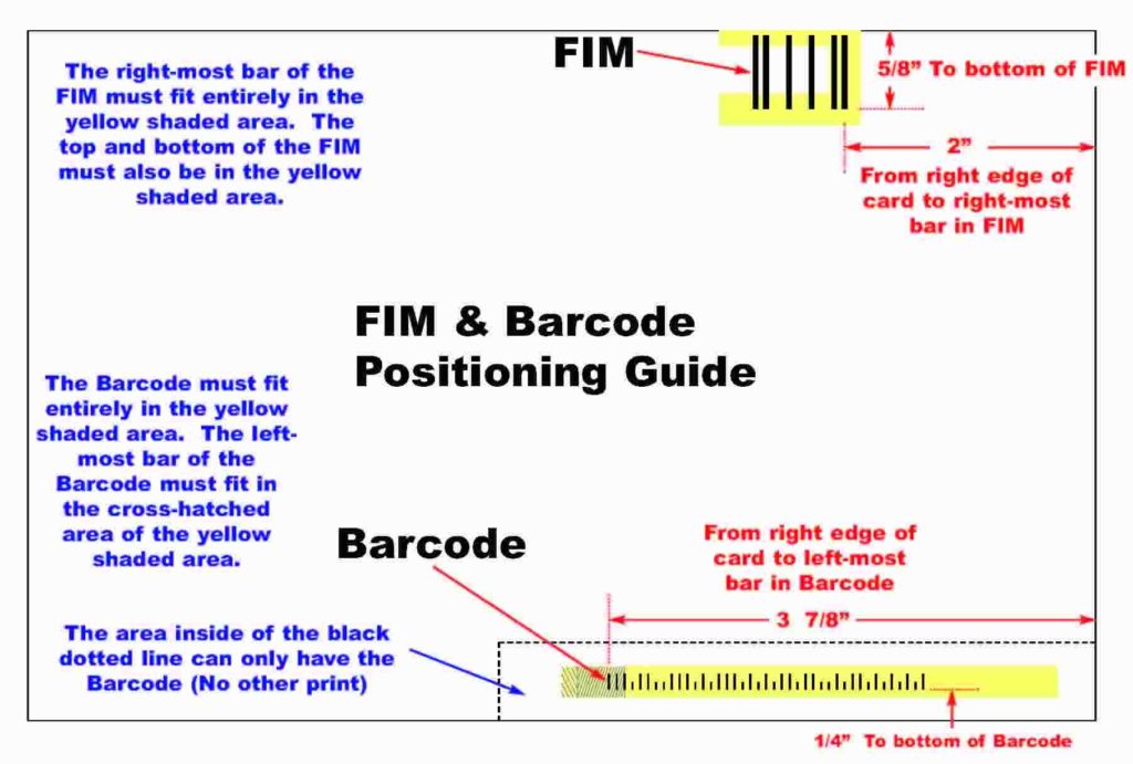
- If you are creating a job with a business reply card (BRC), make sure that the FIM (top bar code) and the barcode (bottom one) are in the correct position according to postal regulations to make sure that it can be mailed.
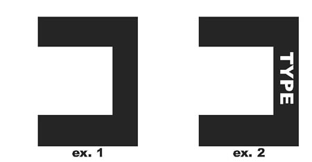
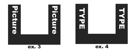
- If you create a colored background as shown in “ex. 1”, please try to reduce the amount of ink being pulled off the press rollers by putting pictures or type of a different color in the area that needs more ink as shown in “ex. 2”. The more ink pulled out of this area, the more consistent the color will be across the width of the piece.


The above examples are to be used on the following piece sizes that will print in portrait mode:
8.5” X 11” Page, Value Sheet, or Single Sheet
3.5” X 7.33” Junior Label
10” X 11” Premium Sheet or Oversized Single Sheet
5.66” X 11” Reply or Premium Postcard
5” X 9” Jumbo Label or Premium Missing Child Card
The Big Sheet is printed 3 up as a Dutch cut, so try to totally avoid this situation if possible. In the case of jobs that will be printed in landscape mode on the press using the same shapes that were shown in the above example, please use the examples shown above to determine where to pull some ink out.
The above examples are to be used on the following piece sizes that will print in landscape mode:
4.375” X 8.5” Standard Label or Coated Label Standard
5.5” X 8.5” Half Page
3.67” X 8.5” Third Page
11” X 19” Premium Four
11” X 20” Oversized 4-Pager
